Farmàcia Esplugas brand identity
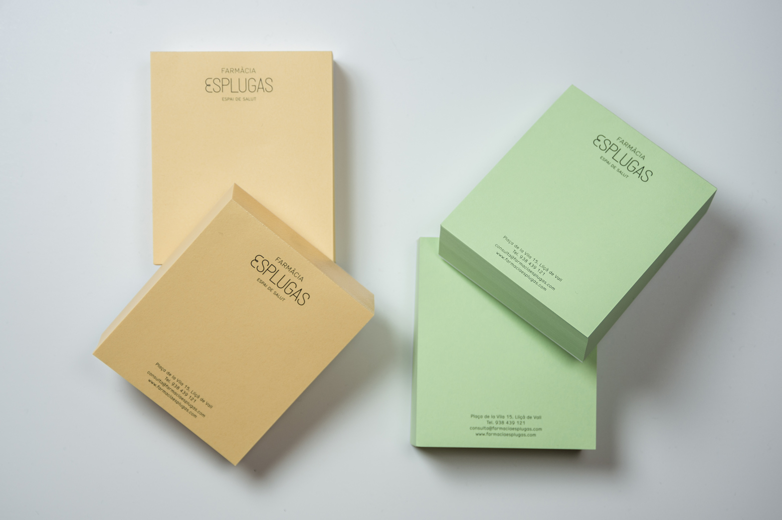
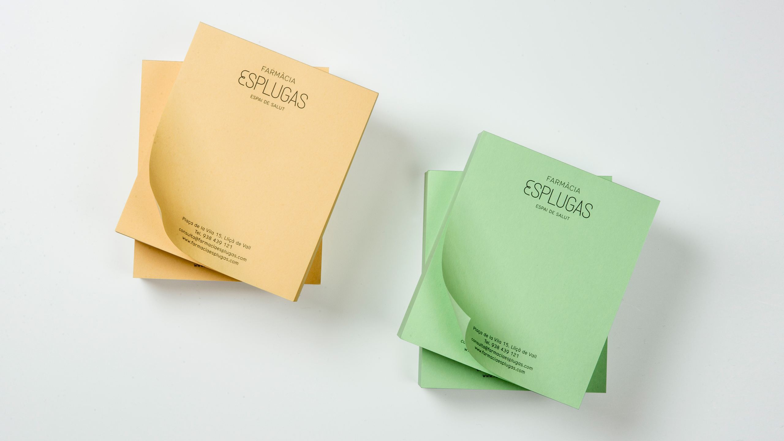
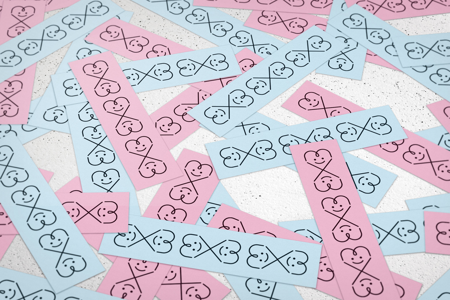
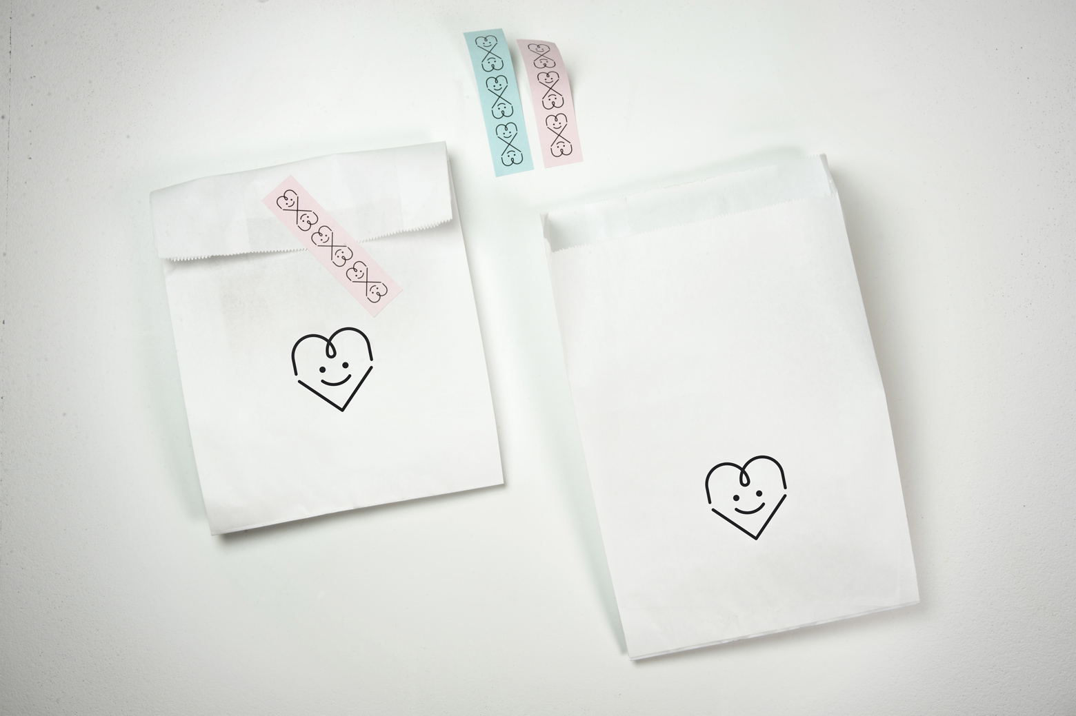
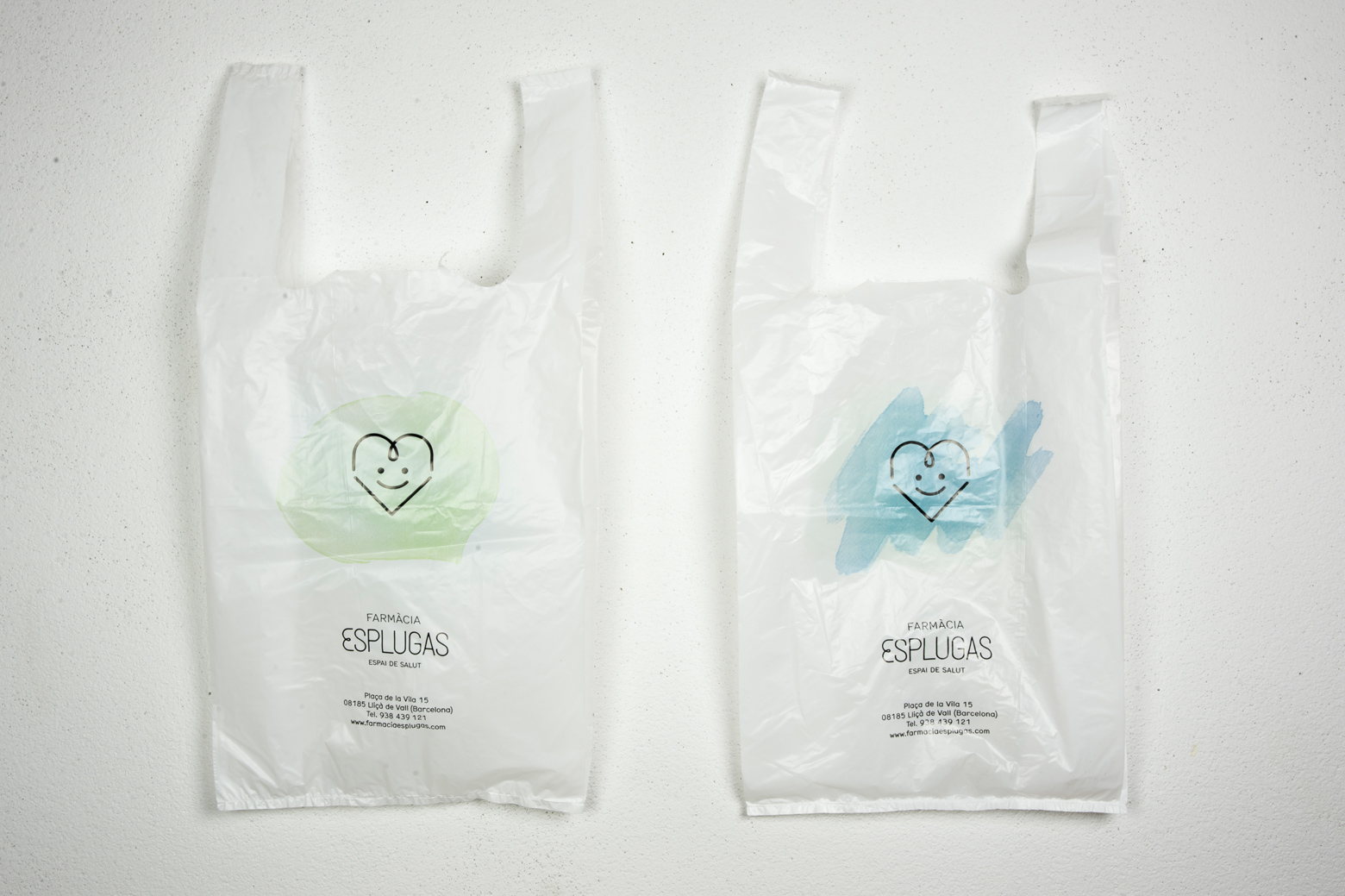
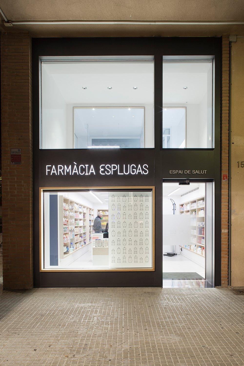
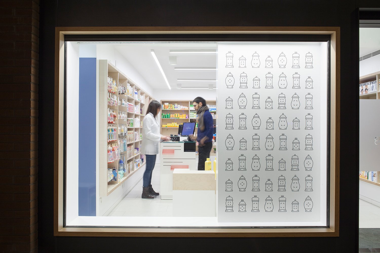
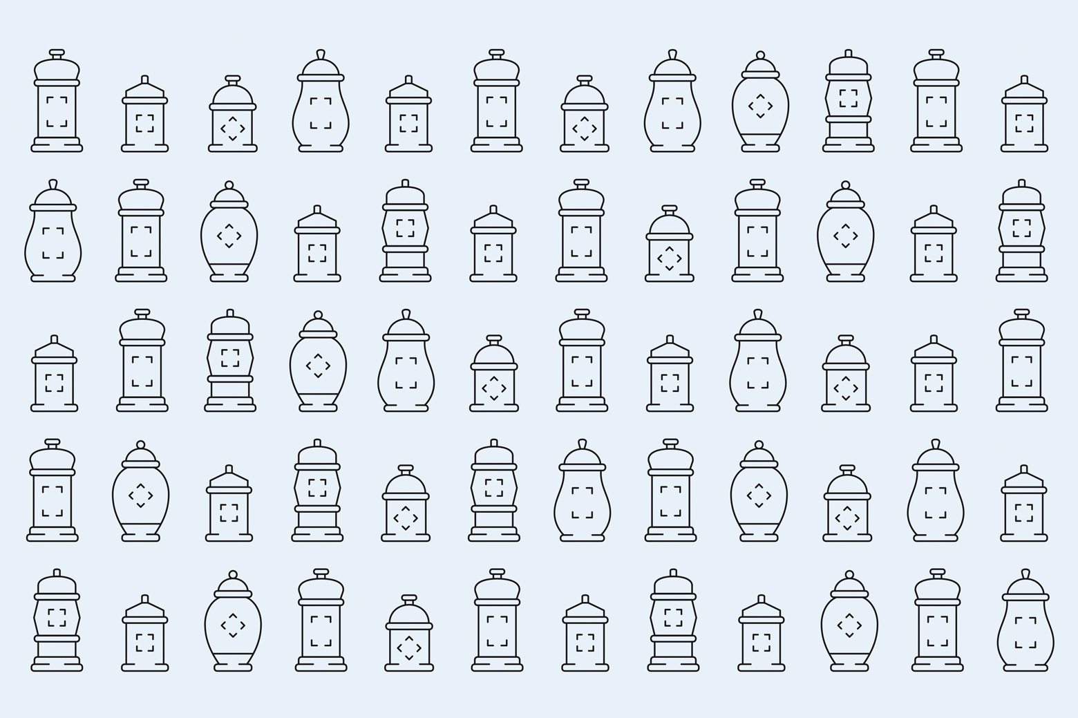
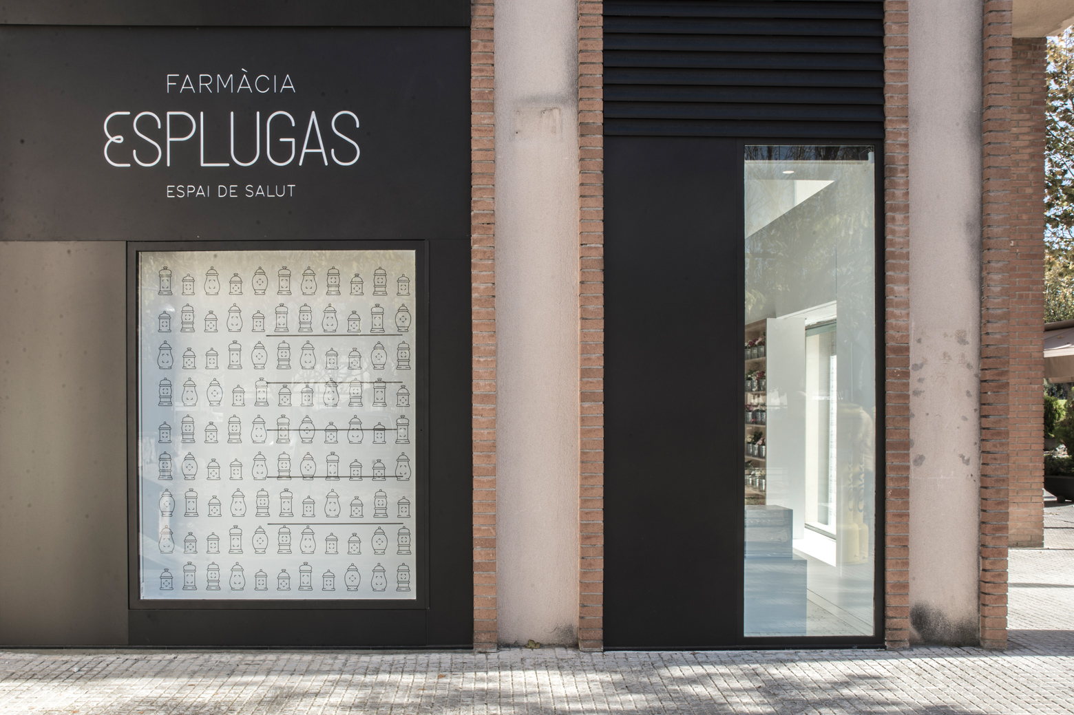
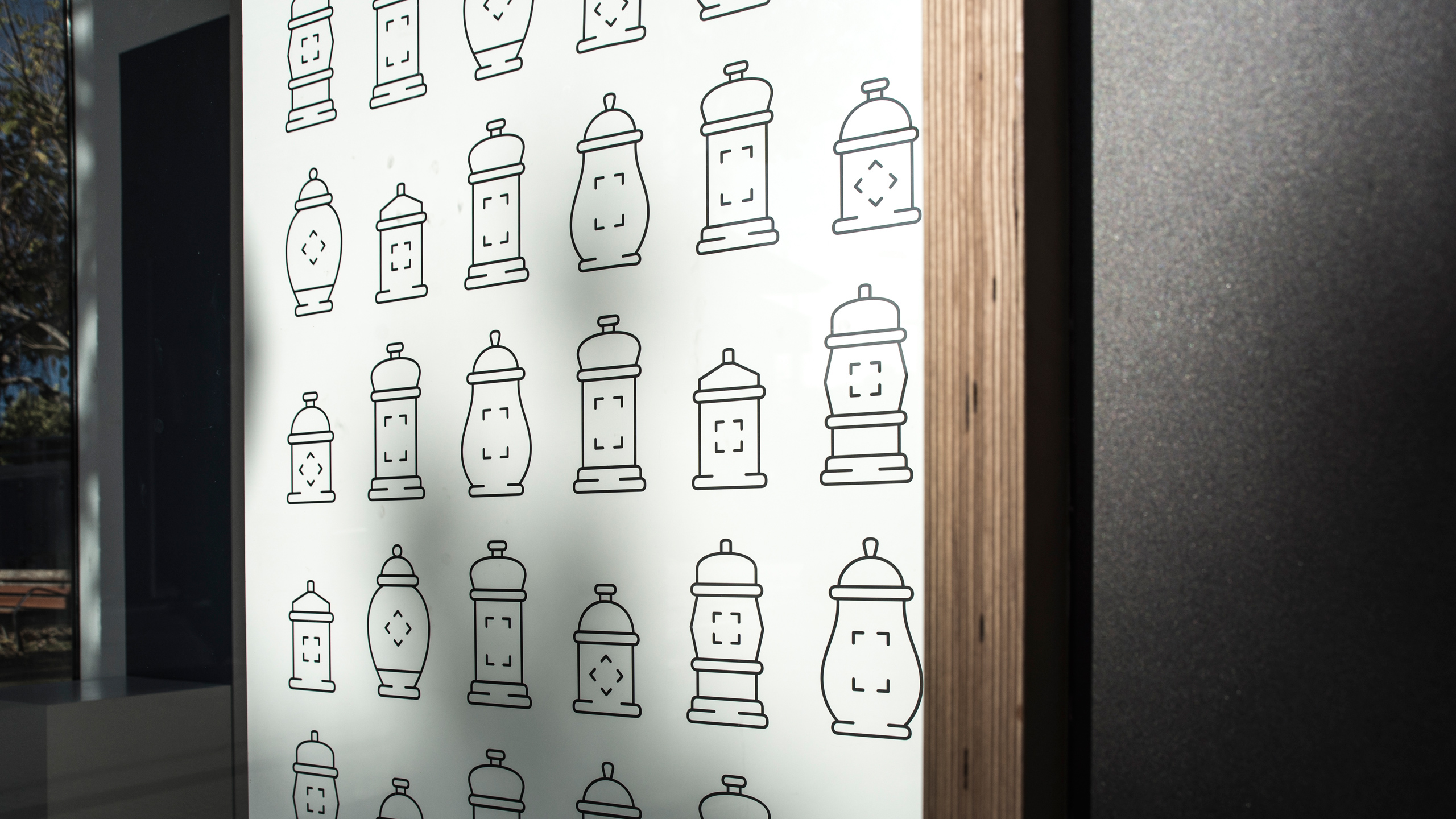
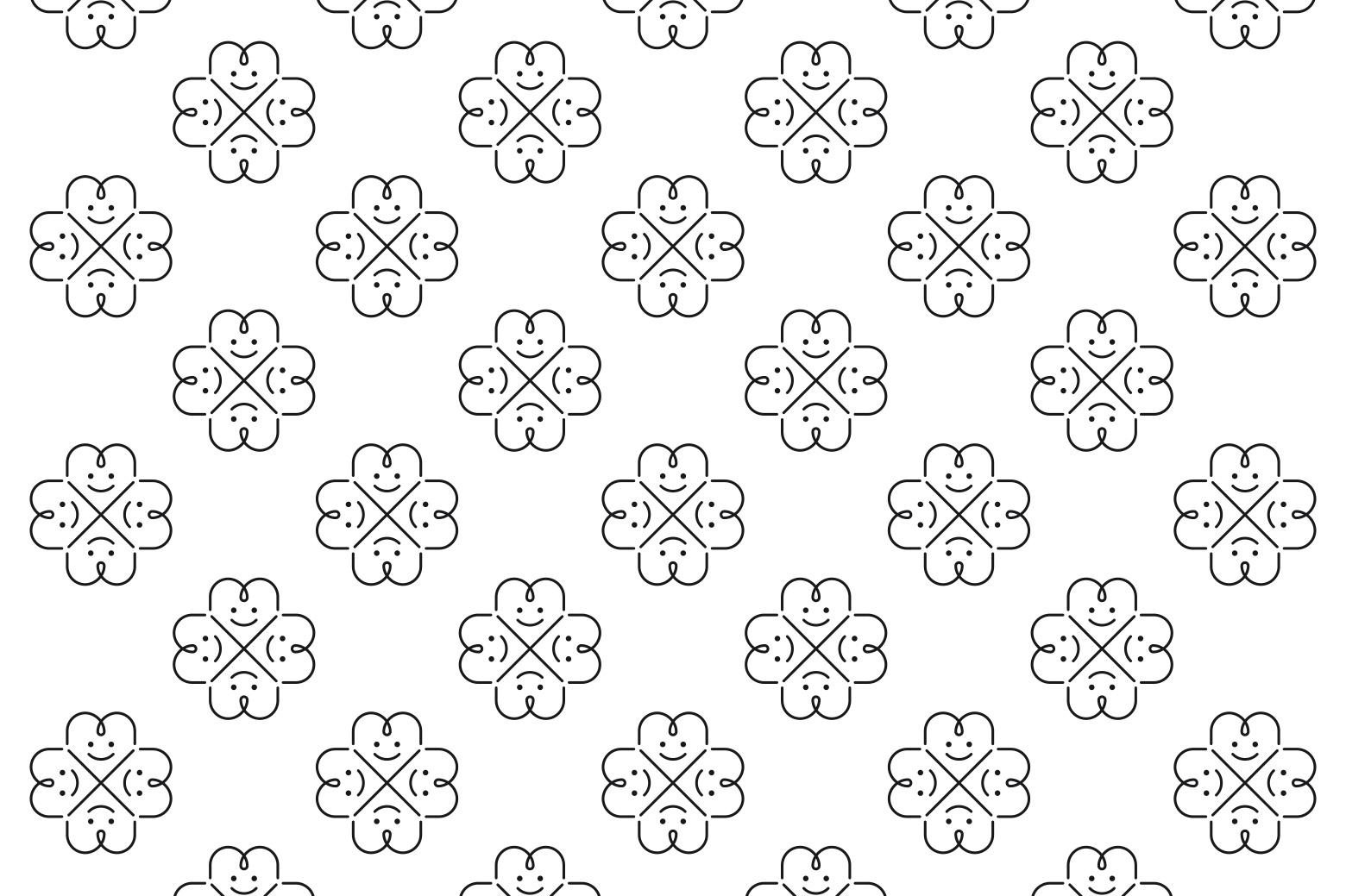
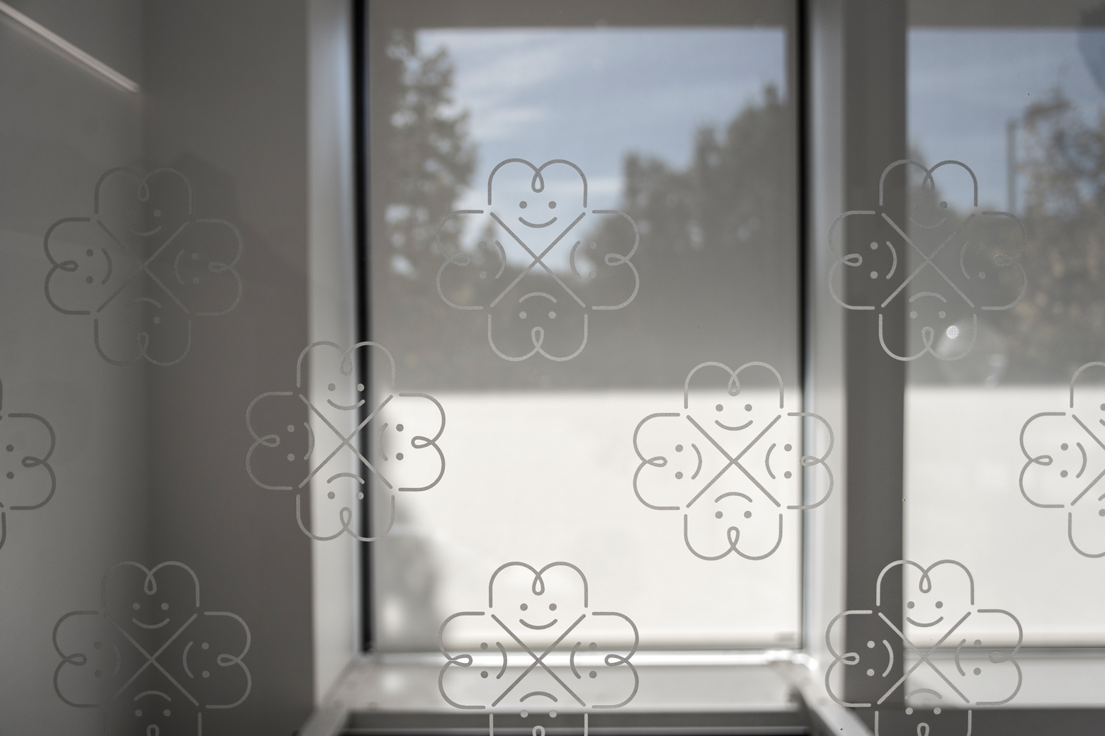
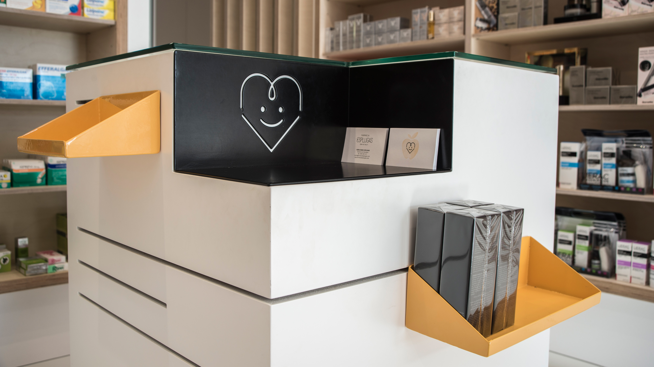
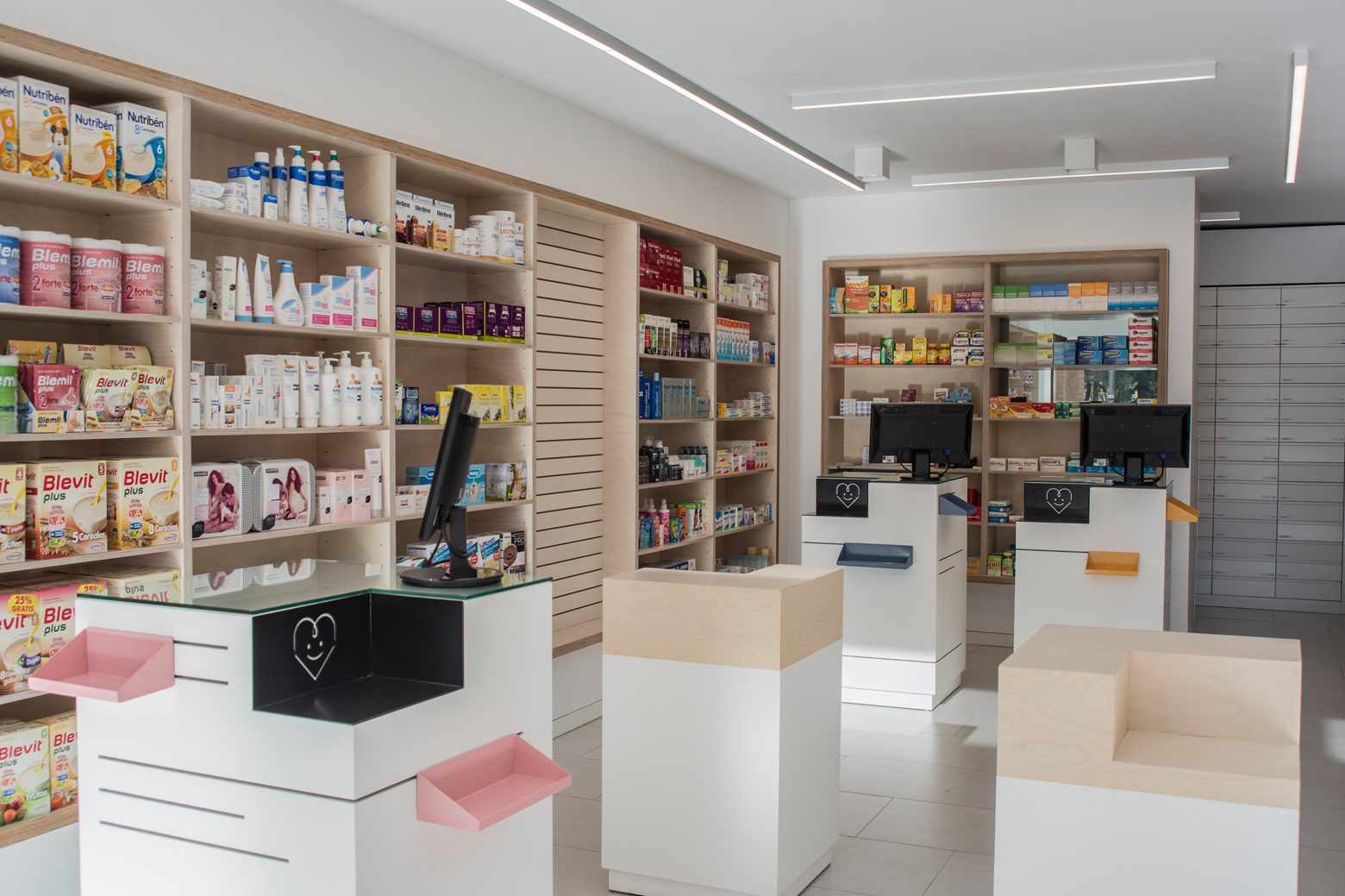
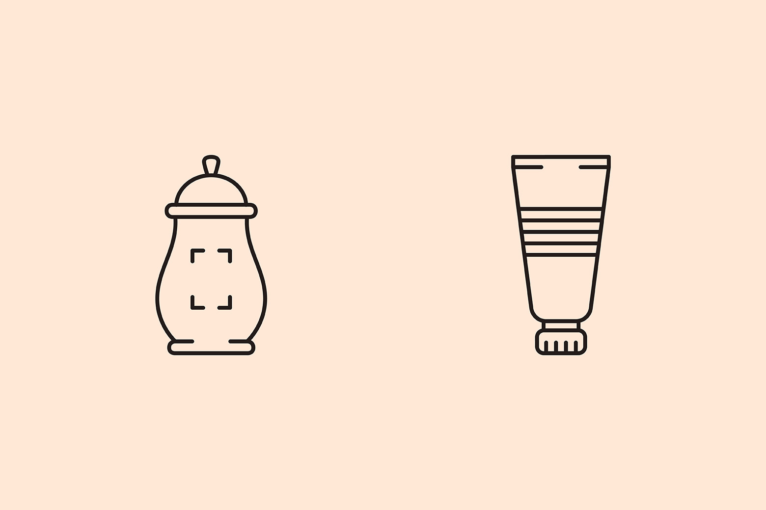
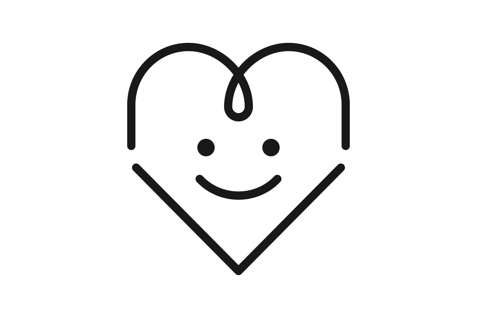
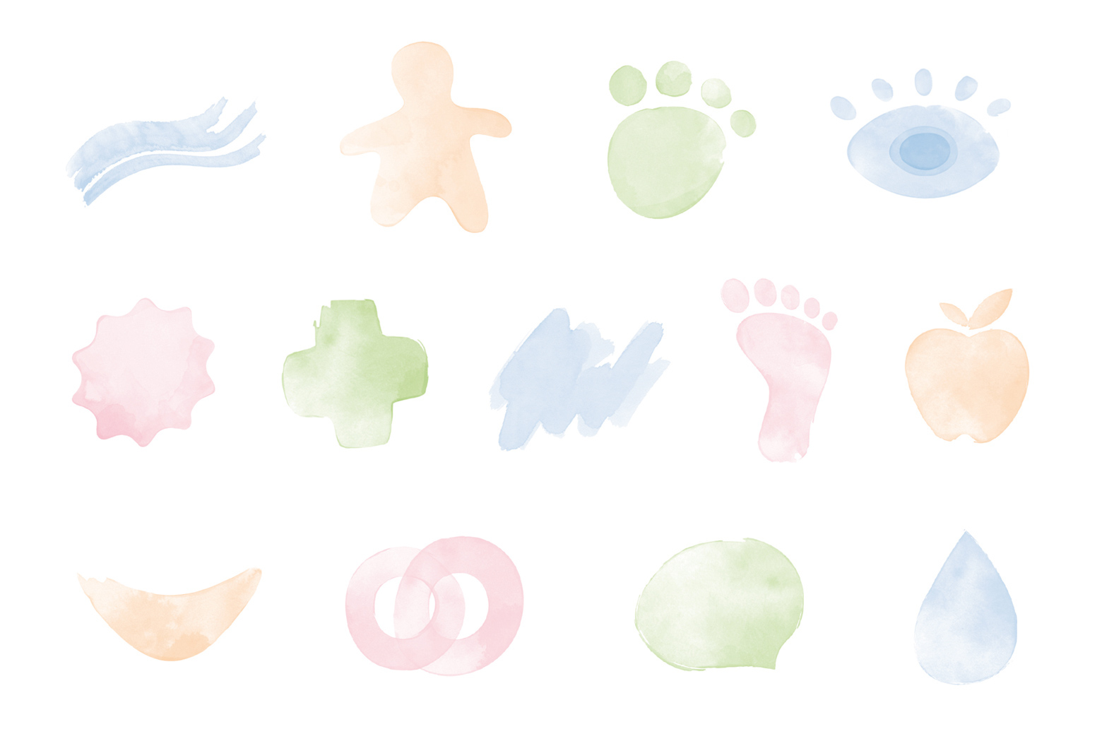
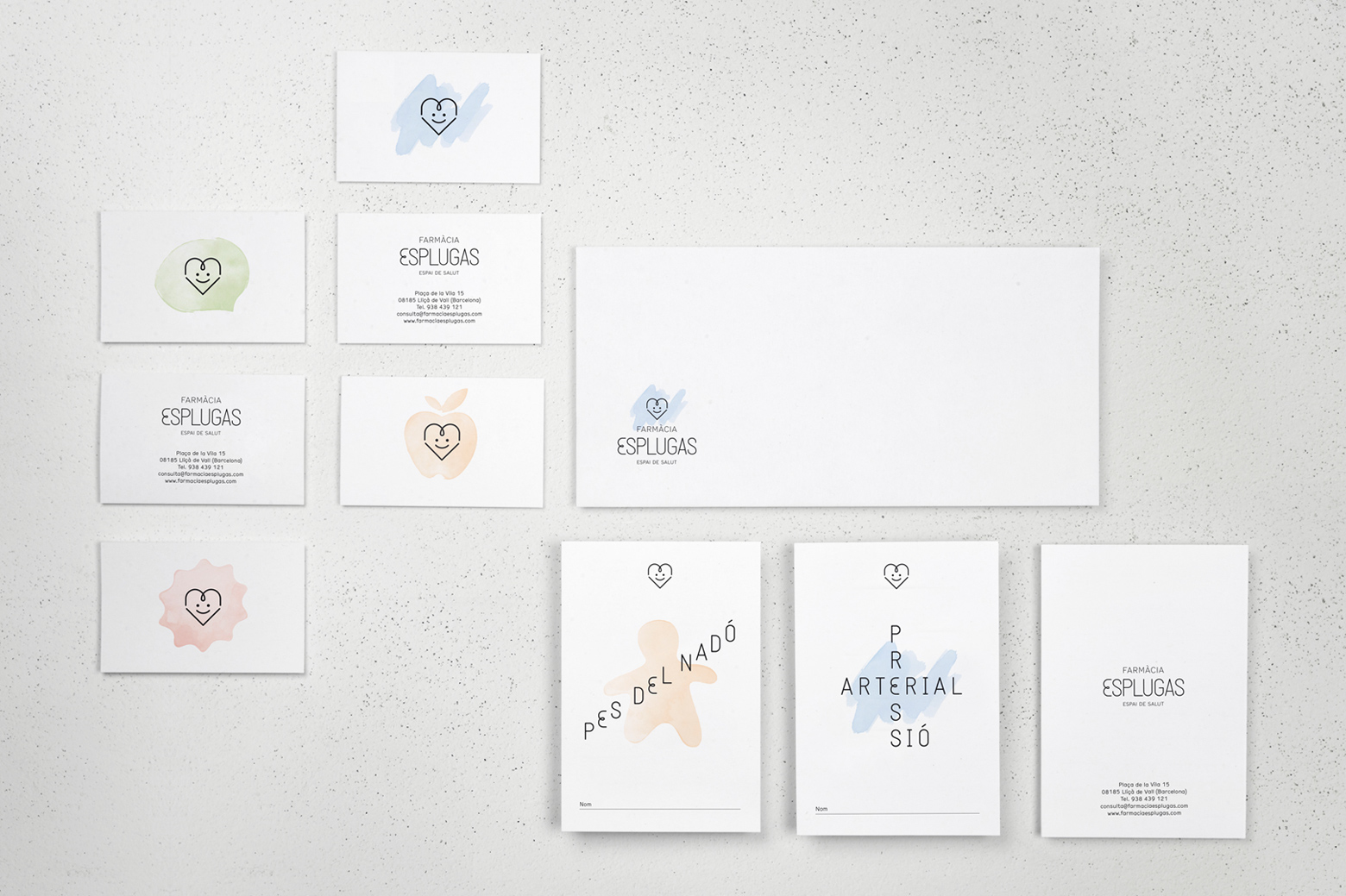
Corporate identity and signage elements for the newly refurbished Esplugas Pharmacy in Barcelona. A graphic identity that goes beyond the concept of the space and helps to transmit an idea related to health. We like to take a positive message and to do it by generating a symbol that represents a happy heart. This symbol is created from the letter “E” which is also the initial word of Esplugas. We have designed the whole alphabet in order to create a personal corporate typeface to use it in various elements of its graphic communication.
Corporate identity and signage elements for the newly refurbished Esplugas Pharmacy in Barcelona. A graphic identity that goes beyond the concept of the space and helps to transmit an idea related to health. We like to take a positive message and to do it by generating a symbol that represents a happy heart. This symbol is created from the letter “E” which is also the initial word of Esplugas. We have designed the whole alphabet in order to create a personal corporate typeface to use it in various elements of its graphic communication.
Architects: Albert Rubio Esplugas + Alexandra Blanch
Photos: Toormix & Borja Ballbé
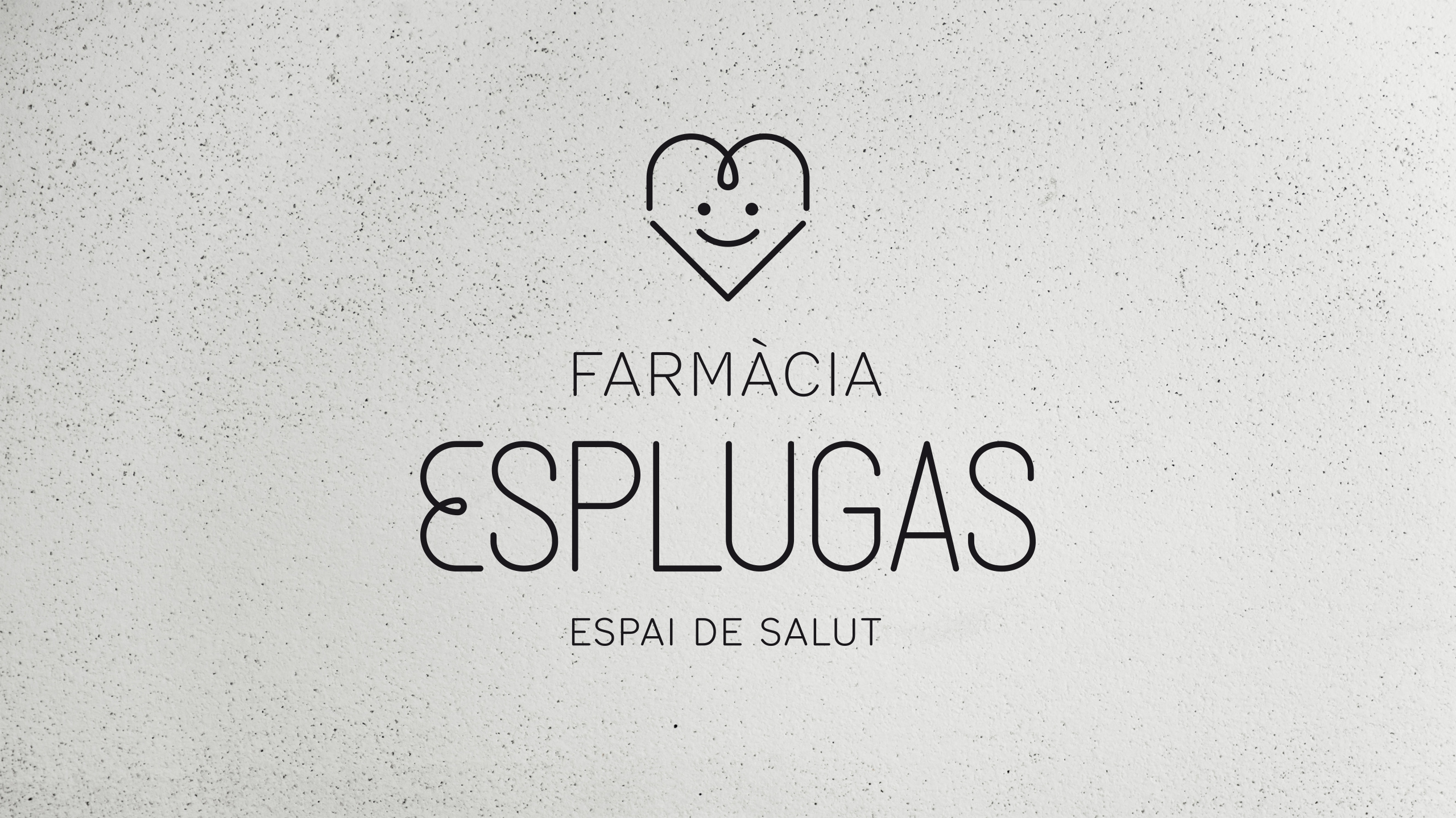
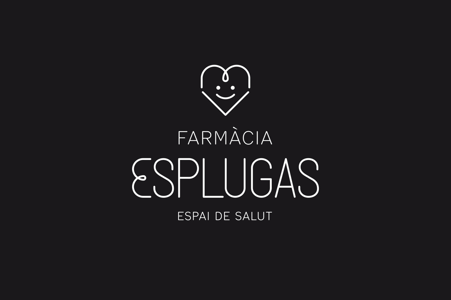
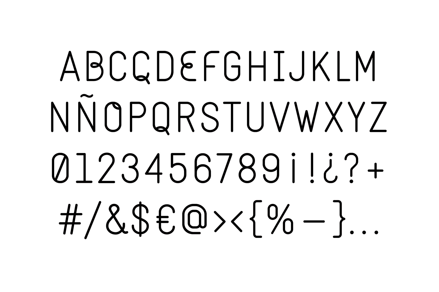
TYPE DESIGN:
Complete alphabet designed ad hoc for the project. The letter "E" from Esplugas will be part of the logotype.